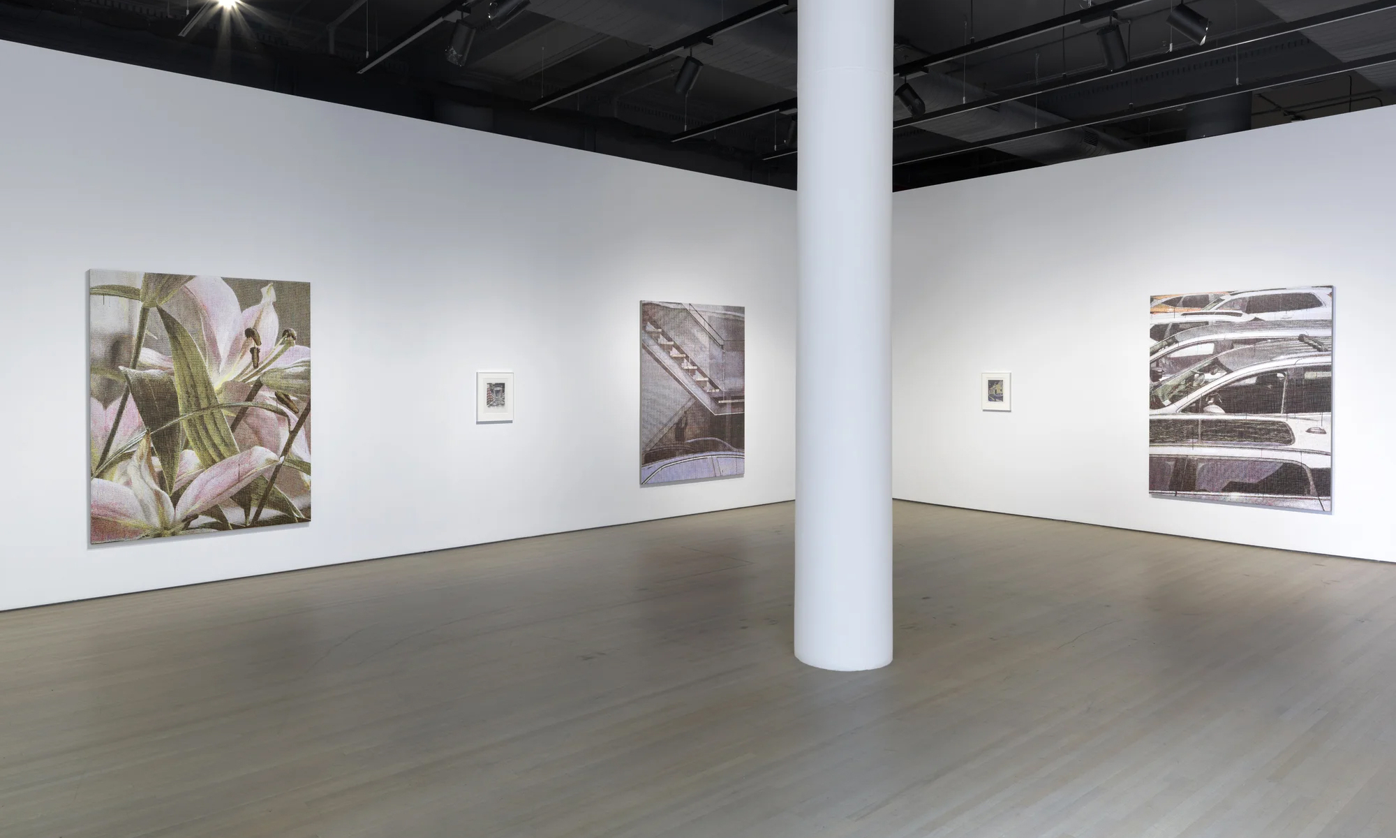
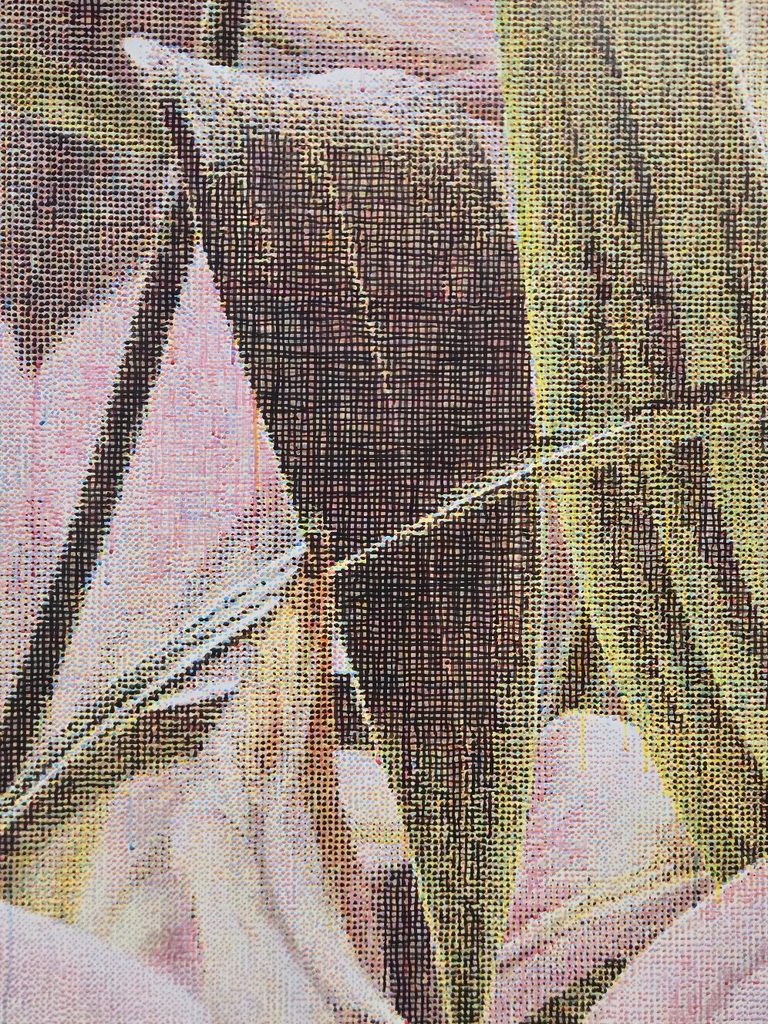
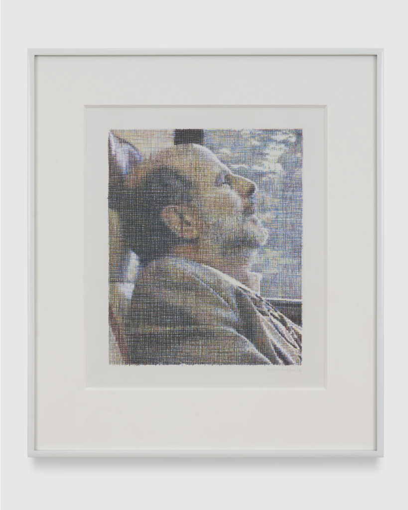
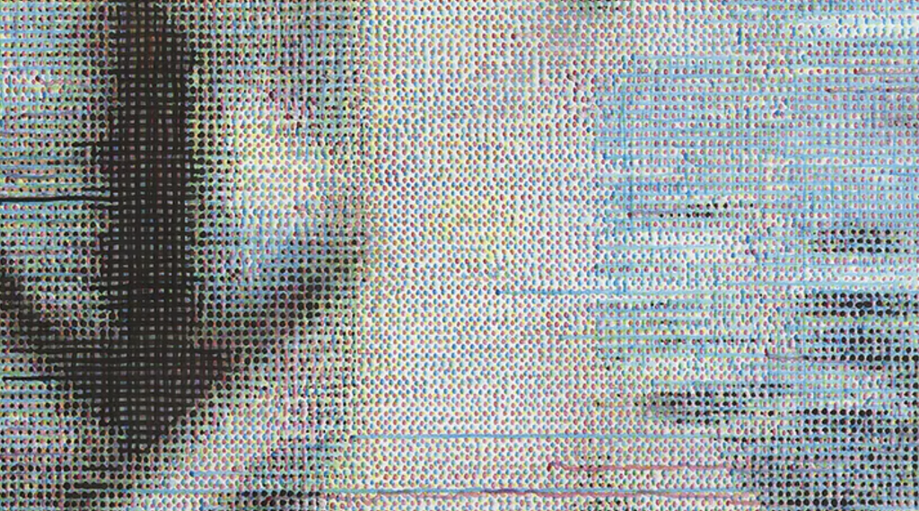
Looking at Asher Liftin’s work, the viewer might first ask, “Is this a textured surface? Is it purposefully pixelated? How is it pixelated?” As the viewer moves closer to these pictures, Liftin’s unique way of building the picture with lines rather than shapes becomes clear, using crosshatching – lines intersecting in different directions to create form and value. Another thought that follows: “Is it ink? Is it paint?” The uniformity of line makes the viewer think that this must be a drawing; however, the distinct paint drips that break the illusion of perfection suggest it is a painting instead. The short answer is both. Spoiler alert: the smaller works used colored pencils, while the larger works used acrylic ink and paint. But most importantly, why are these images so convincingly realistic?
Asher Liftin: Recent Work marks Liftin’s first solo exhibition with 125 Newbury Gallery and second solo show of the year. This exhibition seems tame compared with his Cat’s Cradle show with Nino Mier back in January – February, filled with conceptual drawings of photorealistic hands pulling still life drawings in Liftin’s usual style apart as translucent thread, similar to how the game Cat’s Cradle would be played. This new body of work captures slice-of-life moments of still lifes, casual portraits, and street scenes. However, one thing that is constant throughout Liftin’s work is his signature line work.
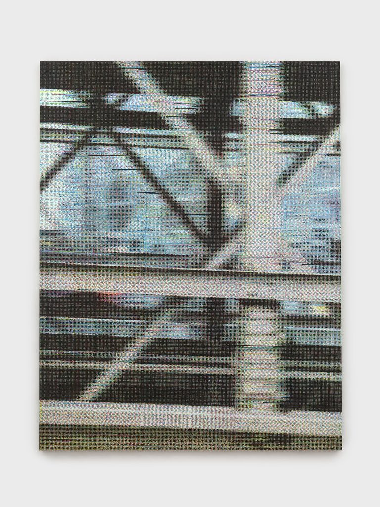
The colors of the lines Liftin utilizes are a recall of the CMYK colors found in a printer. CMYK refers to cyan, magenta, yellow, and key (black). Together, these four colors produce any image when translated from a digital screen to a physical print. Up close, each line and dot represents one of these colors that, from afar, create the optical illusion of a complete photo. Take Brooklyn Bridge, for instance. The viewer can clearly see the four colors of lines and dots where Liftin drags the wet medium, breaking the illusion.
However, utilizing color as an optical illusion is an old idea. The Impressionists were the ones who began the trend of painting with heavier application and visible brushstrokes, instead of constructing paint to “behave” to tell a story, and used brighter colors as they became commercially available.
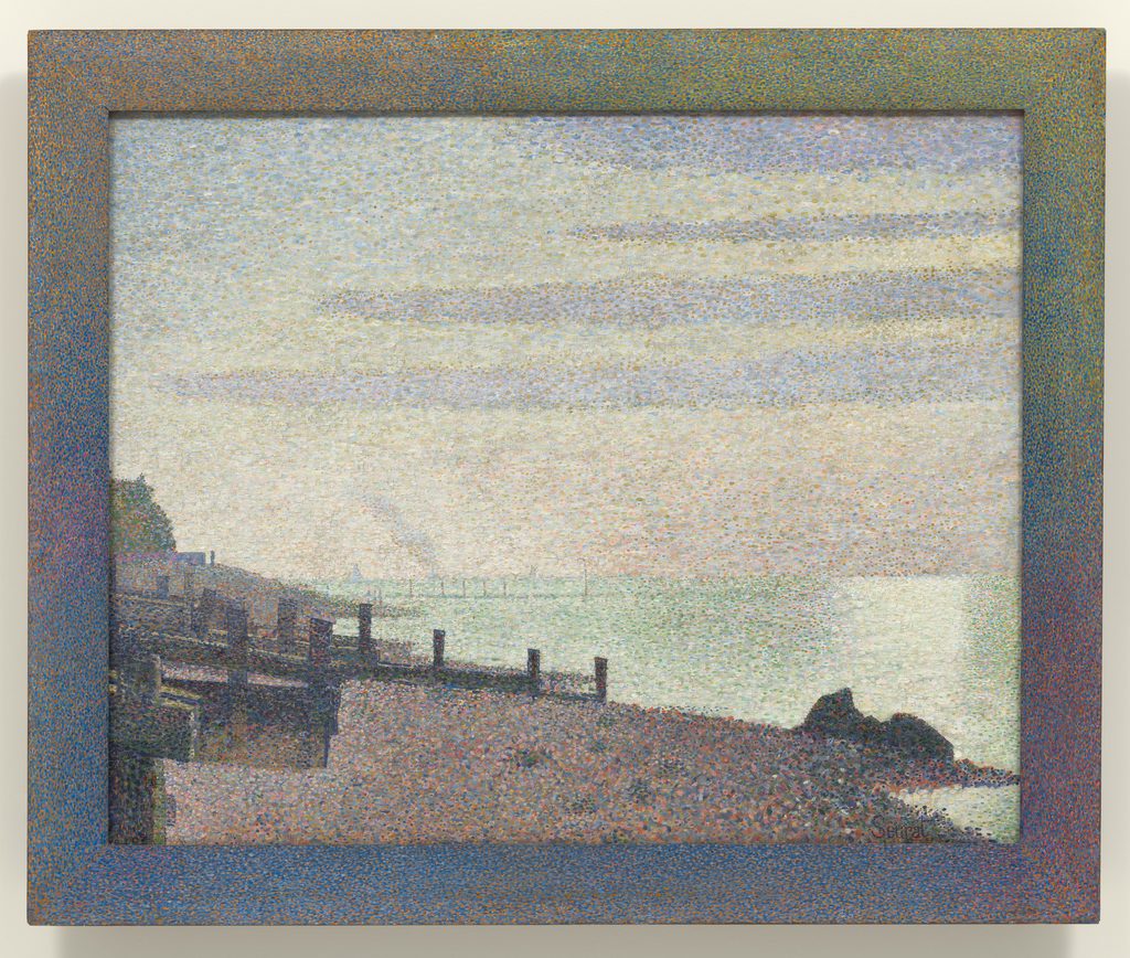
Neo-Impressionists George Seurat and Paul Signac used color as a science by placing different colors next to each other, forcing the viewer’s eye to do the blending and making the picture three-dimensional by replicating how light would work in real life; this was otherwise known as Pointillism: the idea of painting using a range of colored dots to form the image. Liftin uses a similar logic in his work with long lines.
On another note, according to Hans Hofmann, who based his painting ideas on Paul Cézanne, space can be dictated by color depending on its placement on a picture plane, a concept he called push and pull: “Depth, in a pictorial, plastic sense, is not created by the arrangement of objects one after another toward a vanishing point, in the sense of Renaissance perspective, but on the contrary (and in absolute denial of this doctrine), by the creation of forces in the sense of push and pull.” Liftin’s work creates its own kind of push and pull, making the viewer move forward to see what his paintings are composed of, then move backward to see how each colored line completes the picture and reads as realistic.
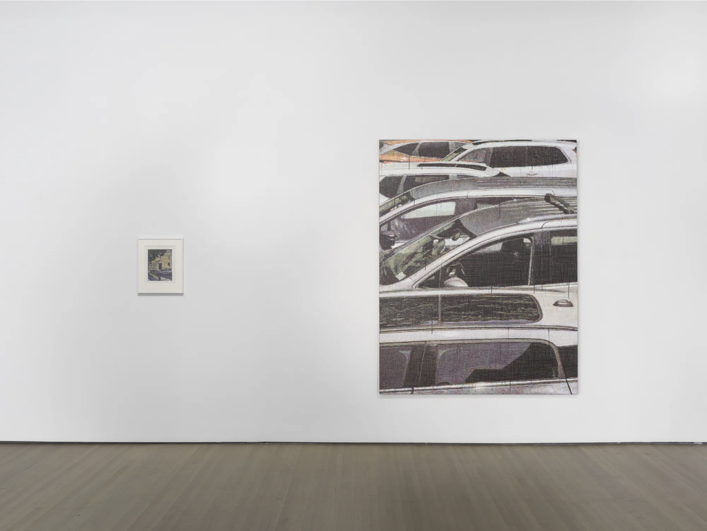
Liftin’s Recent Work reminds us how art history recycles optical illusion concepts in contemporary ways with familiar subjects. Although this body of work doesn’t use traditional rendering techniques as one would expect from Baroque or Neoclassical paintings, for instance, it still produces the same hyperreal effect by breaking the subject’s colors, replicating how our printers use color.
Asher Liftin: Recent Work is on view at 125 Newbury Gallery: 395 Broadway, New York, NY. On view till November 7th. Monday – Thursday, 10 am – 6pm, Friday 10 am – 4pm.
Make your tax-deductible donation today and help Art Spiel continue to thrive. DONATE
About the writer: Sara Aparicio is a Queens-based mixed-media artist and writer. She is currently studying for her BFA in Fine Arts at the Fashion Institute of Technology. There, she also contributes to FIT’s newspaper, W27, as both an editor and a writer. Occasionally, she dabbles in writing poems about what occurred in her life. Similarly, the subject of her artwork primarily focuses on creating accurate representations of her Colombian and Puerto Rican heritage, whilst also raising awareness of issues not spoken about through advocacy in the form of paintings, drawings, collages, and sometimes prints. Her poems and artwork have been published in both an edition of Forest Hills Community Building’s newspaper, The Orbit, and SUNY’s literary magazine, Gandy Dancer. Since 2023, her art has been showcased in Free Arts NYC’s annual Youth Showcase. Recently, Aparicio had her first solo exhibition on view at La Marqueta. You can find more of her artwork on her Instagram page: @sara.aparicio.studio