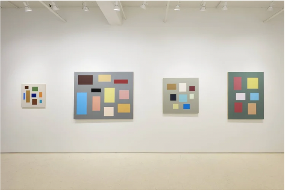
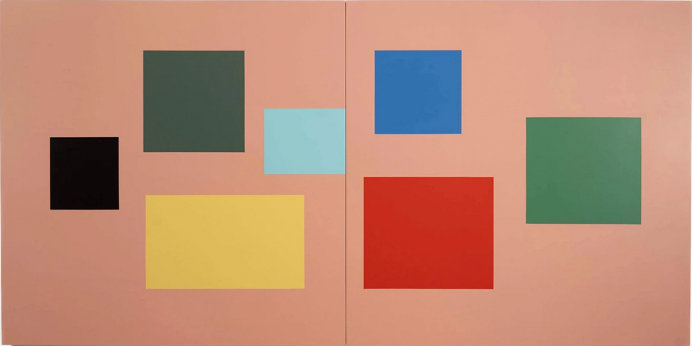
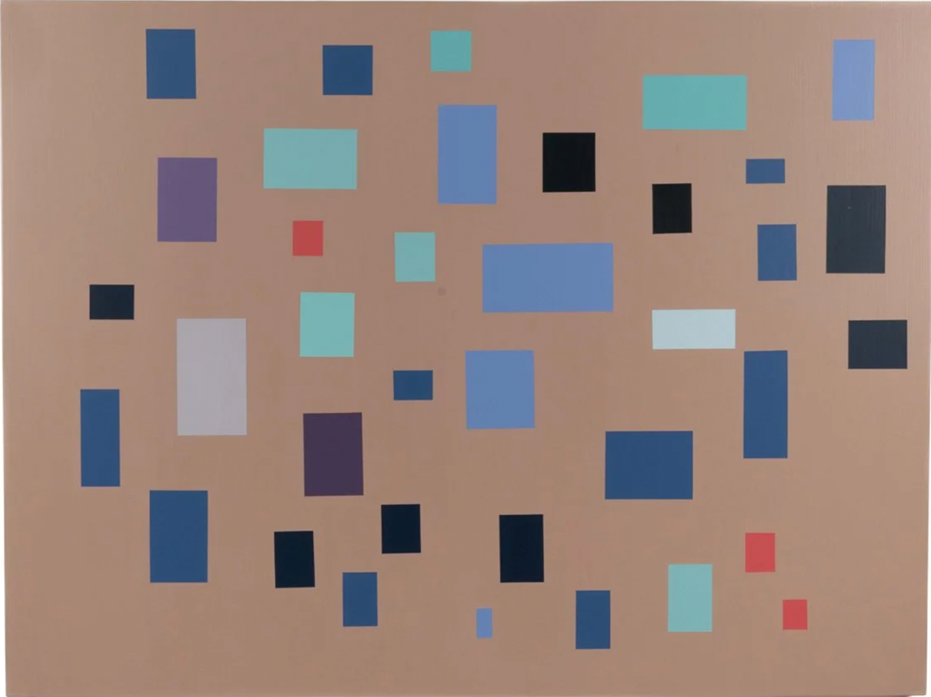
Tom McGlynn continues to grow a decade-long train of thought with a new selection of paintings in This Here at Rick Wester Fine Art. Consistent with his oeuvre, he arrays a selection of color rectangles suspended within various fields of color. An acquaintanceship with the origin of this direction, accompanied by a fresh pair of eyes, will enable a viewer to put aside the parallels with Mondrian, Albers, or even Hans Hoffmann, and see these works anew.
At this juncture, although McGlynn appears to be aiming for the ideal of the thoroughly non-referential or non-objective, the paintings remain recognizably earthbound. This is made evident by the touch of the hand through paint edges and brushstrokes.
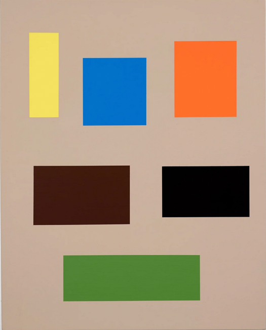
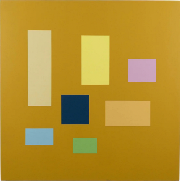
The paintings are acrylic on wood panel, with sizes and formats that run the gamut from square to rectangle in a variety of proportions, echoing the variations in the color shapes. The shapes generally form configurations or constellations depending on subtle organizational details. They reach an invisible perimeter, becoming finite groups. Space, such as there is, is extremely shallow – a painting space suggested by subtle shifts of color or value forward or back. While stillness predominates, one may infer subtle, directional movements, circular or vertical.
One might wonder what a world without rectangles might look like. There are no rectangles in nature, so we invented them to define space, tidy the view, and organize our thoughts. They are so definite, and here they are even slightly imposing as they march forward to occupy the foreground.
The compositions are consistently balanced and organized around variations in hue, value, and saturation. No one shape ever dominates within a work; the focus is distributed across the entire piece. The most consistent and extreme aspect of the show may be the lack of drama.
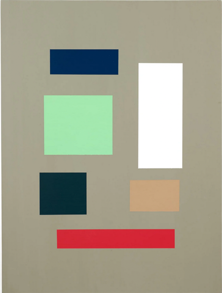
Looking for relationships between the colors can seem futile. The only thing that may unite those within a single work is that they share the same space. One cannot easily discern the degree to which the hue selections and arrangements are improvised or calculated. The logic at work is ambiguous, as is the relationship between the colors themselves or between the colors and negative space. This territory is not very spatial, but made of color matter that is as substantial as the floating rectangles.
Looking at the variety of proportions and organization, an expression like ‘random order’ comes to mind. The works feel both definitive and simultaneously free from, suggesting an open-ended, inconclusiveness. One could almost imagine them reconfiguring themselves, maybe after hours, when the lights are out.
But that may be too playful a notion. There is a ‘today’s menu’ aspect to the delivery, like a color report, as a matter of fact. But there is also a touch of the lyrical. One might detect some musicality as referenced in the press materials – each painting like a color theremin. Though the smallest works can acquire a degree of charm, the general impression may be of extreme, analytical formality. So yes, one draws contradictory readings.
The paintings are not color theory exercises or Bauhaus throwbacks. Though colorful, they are not opulent or colorist in the sense that the label implies. It is safe to say that among the range of hues, one is likely to encounter some that they do not particularly like.
McGlynn does not entertain. He employs the occasional interactive effect but does so sparingly, avoiding indulgence. While his thinking and execution are extremely consistent, the individual paintings remain distinct. One does not see a repeated gesture or effect.
What’s In Store occupies the entry to the gallery. It serves as a greeter or lure with a misdirecting message. It has a more eye-catching palette and is the only off-center, slightly cantilevered composition. It is a deviation from the overall neutral character of the works presented. Just as well, it be isolated in its own nook, lest it upset the show’s balance.
The more time one spends looking, the more distinctions one will find. In Force Major, the color shapes sit about like furniture in a room. Kiss and Make Up is the most heavily populated work, and employs a more familiar, viewer-friendly ‘family’ of blue variants that play kindly with warm reds.
The ‘in your face’ presentation and immediacy of that experience do not lead to a quick read. There is plenty for the patient viewer to consider, and curiosity will increase one’s capacity for seeing. Tom McGlynn has tapped a rich vein in the works’ potential for options without end. This, in turn, points to the infinite, which may be where these paintings actually exist- somewhere outside of time.
Join us Dec 19 for the Art Spiel 2025 Brooklyn fundraiser featuring 200+ artists’ works RSVP here
Tom McGlynn This Here at Rick Wester Fine Art
October 16 – December 20, 2025
Rick Wester Fine Art
526 W 26 Street, New York
About the writer: Peter Schroth is a Brooklyn-based artist. @petereschroth
Related articles:
https://artspiel.org/emily-sundblad-the-adolescent-ocean-at-bortolami/