
Installation view of The Agreement: Chromatic Presences, curated by William Corwin at Zürcher Gallery. Photo: Adam Reich. Courtesy of Zürcher Gallery NY/Paris.
I’ll start with a question: does a critic have an obligation to propose a solution to an enigmatic puzzle an exhibition might pose? What has led to this, is reading William Corwin’s catalog essay for The Agreement: Chromatic Presences, in which he ignores recounting the history of sculpture and color—deemed for a very long time to be irreconcilable like fish and cheese. It is now common knowledge, sculpture till the time of the renaissance was largely polychromed, but a neo-classical notion of purity and essentialism came to be imposed upon it to differentiate it qualitatively from painting. As a result, sculpture came to be limited to the colors of its materials—marble, bronze and wood. In the West, this formalism was institutionalized by the Enlightenment’s and was the excepted norm until the mid-20th century, when art’s traditional forms began to morph. Consequently, we must ask if there is a more contemporary issue concerning color and form at the heart of Corwin’s The Agreement: Chromatic Presences, and if so, what might it be?
We can of course avoid this question altogether by looking at each work in this show as if it stood alone, unlinked to the next. Yet, that does not really solve the problem for we must assume that each work is only present because it is meant to contribute in some part to our comprehension of the whole. If we return to the catalog, Corwin’s account of his subject: color and form is ontological, metaphysical and mythical–he begins with the story of the Flood and the symbolism of the rainbow as god’s sign of reconciliation with humankind. Ironically, this somewhat skewed approach, with its avoidance of modernist taboos, and post-Modernist concerns gives this multi-generational-idiosyncratic exhibition its strength.
Corwin’s aesthetic intuition rather than a conceptual agenda has resulted in an exhibition that is both funky and formal. The works that make-up The Agreement: Chromatic Presences, range from the formalism of Tom Doyle’s proto minimalist, polychromed, Title Unknown (1964-5) to the informalism of Kanja Strobert’s post-minimalist blue monochrome, Tie, (2017-19) through to the kinky baroque excesses of Daniel Giordano’s Cannoli (My Falcore) (2016-22.) From this, if Corwin’s principal concern is with the question of how artists today use color, this seems to be a bit of a red herring, in that the answer is every which way.

Installation view of The Agreement: Chromatic Presences, curated by William Corwin at Zürcher Gallery. Photo: Adam Reich. Courtesy of Zürcher Gallery NY/Paris.

Installation view of The Agreement: Chromatic Presences, curated by William Corwin at Zürcher Gallery. Photo: Adam Reich. Courtesy of Zürcher Gallery NY/Paris.
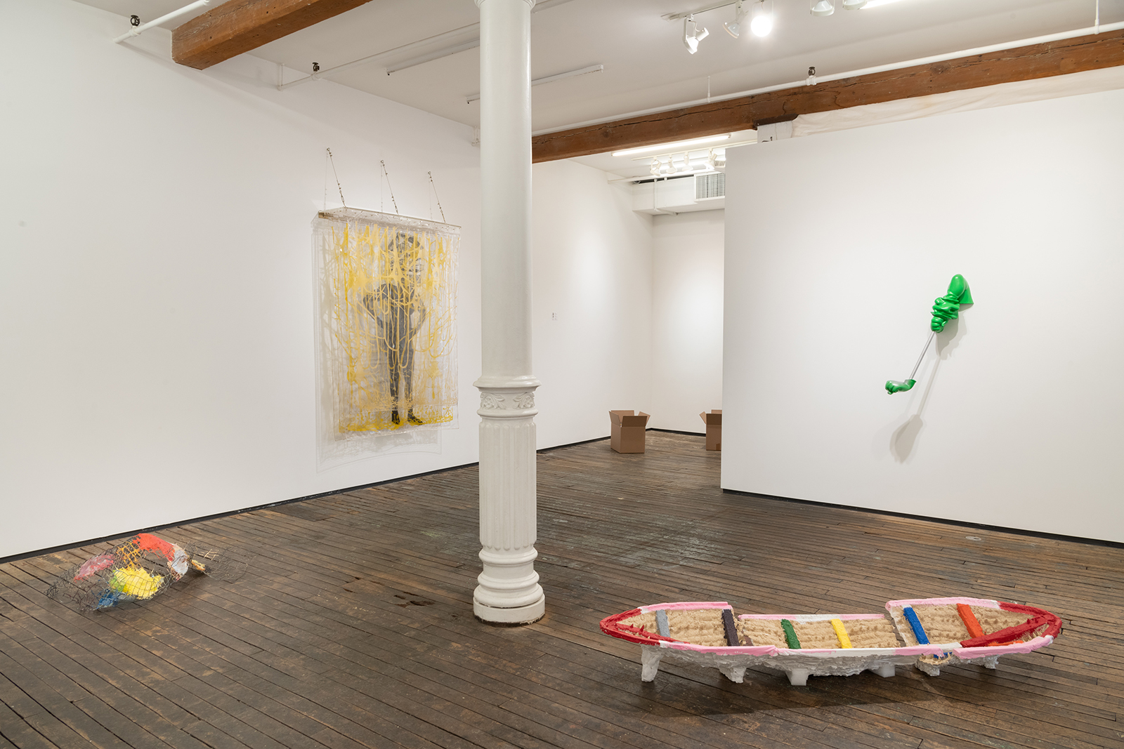
Despite the fact that every work in this exhibit to some degree employs color–in actuality, none leaves a particularly strong impression in the sense that color tends not to play a significantly symbolic or structural role in the works presented—this is even true of Corwin’s own Sutton Hoo (2022) whose polychromed boat-like form is perhaps the most colorful work in the show, but whose use of color tends to be decorative. Closest to actually being concerned with color effect on form is Ugo Rondinone’s green yellow blue mountain (2022), which consists of a stack of 3 hand-sized rock-like forms each having been painted a different color—the optical effect is that the work nearly floats. For most others, such as Remy Jungerman’s Horizontal Oberhausen KANGAA (2020) an assemblage of painted geometric, and linear wooden forms, or Poppy Deltas Dawns’ Lucky (2021) made of red wool, color seems to be incidental. In a more pictorial vein is, Kianja Strobrt’s Copacabana (2018-19), in which a gradated hot pink is used to descriptively re-enforce the sinuousness of her biomorphic papier mâché form.
Given the diverse practices Corwin recruits to his cause, the exhibition functions as an index of hybrid object-oriented formats. That index is supplemented by a secondary one–in which color can be sorted into the categories of applied, intrinsic, and found. A tertiary index also runs through the show–this one includes the formal, expressive, and symbolic. As such Lynn Umlauf’s May 10, 1986 consisting of gestural painting on a substratum of diverse materials may come to be classified as an expressive form with applied color, which is aesthetically abject. To a lesser degree there is also an aesthetic index–yet few of the works Corwin has selected fall under the headings of voluptuous, industrial, or beautiful. Though Andrew Ross’ the Mic is Mightier than the Pen (2019) open-source forms, harvested from the internet coated in a shimmering iridescent pigment and Sun You’s No Title (2022) cardboard box containing a layer of small multi-colored, flat clay figurations forming an abstract composition come the closest to diverging from the over-all hand-made quality of everything else in the show. There are also outliers such as Nancy Shavers’ almost folk art-like predominately pink assemblage of mosaics, blocks of wood and metal rods and Shervone Neckles’ wall hanging of house headed black silhouette of a female figure entangled in pollock-like network of gold-colored gestural loops and splatters silk screened onto clear vinyl.
If these indexes are the key to the concepts encrypted in Corwin’s effort, we can use them to navigate the intersecting storylines intentions and agendas that have guided his choices. With this in mind, returning to Corwin’s catalog essay in which he links the use of color to the existential issue of what may lay beyond presence—the implication is such formal issues as to how color may be used are actually, issues of identity—the terms and conditions by which a thing is defined. As such, one might take this exhibition to be an allegory for the dynamics of identity not in its present political formulation, but in accord with the cognitive structures from which distinctiveness derives its content–as such the conclusion that can be drawn from The Agreement: Chromatic Presences is that identity is in always, both phenomenal and conditional—not one, or the other.
Installation view of The Agreement: Chromatic Presences, curated by William Corwin at Zürcher Gallery. Photo: Adam Reich. Courtesy of Zürcher Gallery NY/Paris.
The Agreement: Chromatic Presences is Curated by William Corwin, on view until May 11 at Zürcher Gallery, New York, 33 Bleecker Street, New York, NY 10012
Saul Ostrow is an independent curator and critic. Since 1985, he has organized over 80 exhibitions in the US and abroad. His writings have appeared in art magazines, journals, catalogues, and books in the USA and Europe. In 2010, he founded along with David Goodman and Edouard Prulehiere, the not-for-profit Critical Practices Inc. as a platform for critical conversation and cultural practices. His book Formal Matters (selected and revised) published by Elective Affinities will be launched Fall, 2022. He served as Art Editor at Bomb Magazine, Co-Editor of Lusitania Press (1996-2004) and as Editor of the book series Critical Voices in Art, Theory and Culture (1996-2006) published by Routledge, London.